
Enterprise QA Automation Platform:
Test Lifecycle & Execution Management
Designing end to end workflows for test creation, execution, debugging, and defect management across multi-tenant enterprise environments.
B2B SaaS
QA Automation
Enterprise Platform
Multi-tenant


ROLE
Product Designer
DURATION
8 Months
USERS
QA Engineers, Automation Engineers, Engineering Managers
PLATFORM
Web
(Internal + Client facing)
PROBLEM
Large enterprise teams struggle to manage automated and manual testing at scale across multiple tenants, environments, and experiences. Existing tools often expose system complexity directly to users, resulting in:

High cognitive load during test setup
Poor visibility into execution outcomes
Slow defect triage and debugging
Fragmented workflows between testing and issue tracking
The challenge was to design a cohesive, auditable QA automation experience that balances power, clarity, and enterprise constraints.
USERS
To design an effective QA automation platform, we identified distinct user roles with overlapping but clearly differentiated needs. The platform was designed to support all roles without fragmenting workflows.
QA Engineer
Ensure test coverage and validate product quality
PRIMARY GOALS
-
Define test steps and expected results
-
Create and maintain test suites
-
Execute test runs
-
Raise and track defects
PAIN POINTS
-
Manual effort in managing test cases
-
Limited visibility into execution failures
-
Context switching between test tools and defect trackers
Automation Engineer
Maintain reliable and scalable automated tests
PRIMARY GOALS
-
Debug failed automated tests
-
Analyze logs and screenshots
-
Manage execution environments
-
Optimize test performance
PAIN POINTS
-
Poor error visibility in large test runs
-
Difficulty tracing failures across environments
-
Noise in logs without clear hierarchy
Engineering Manager
Monitor quality trends and release readiness
PRIMARY GOALS
-
Track pass or fail rates across environments
-
Review open defects and execution health
-
Make go or no go release decisions
PAIN POINTS
-
Aggregated metrics buried under technical detail
-
Hard to assess risk at a glance
-
Limited traceability between failures and business impact
Client / Tenant Admin
Configure and manage tenant level testing
PRIMARY GOALS
-
Manage environments (Dev, QA, Staging, Prod)
-
Configure integrations (Jira)
-
Maintain locale and URL settings
PAIN POINTS
-
Complex configuration with little validation
-
Risk of misconfiguration impacting test reliability
DESIGN IMPLICATION
The platform needed to support deep technical workflows without overwhelming non technical stakeholders, leading to a design approach focused on progressive disclosure, and clear hierarchy.
SCOPE & RESPONSIBILITIES
I led the UX design for core test lifecycle workflows, including:
Test suite creation and cloning
Test run orchestration
Test case and scenario management
Defect creation and traceability
Execution results and metrics visualisation
Environment and integration configuration
I collaborated closely with:

QA Automation Engineers

Backend Platform Teams

Product Managers

Client Stakeholders
INFORMATION ARCHITECTURE
Platform Structure
One of the core challenges was helping users distinguish between test definition (what should be tested) and test execution (what actually happened), without exposing internal system complexity.
CORE WORKFLOWS
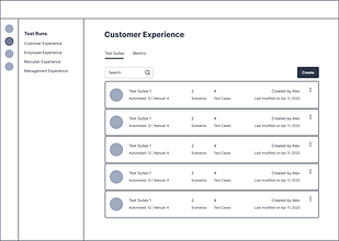
Creating & cloning test suites
Enable teams to efficiently create or replicate structured test coverage across tenants, environments, and products without introducing configuration errors.


SOLUTION
Guided progression to reduce setup errors
Progressive disclosure of complex configuration options
Reusable structures to support enterprise scale duplication
Clarity over flexibility in high risk setup actions
Cloning was designed as a first class action because enterprise QA teams frequently replicate configurations across regions (US, India, UK, etc.).
Test run creation & scenario selection
Allow users to define what to execute, where to execute it, and at what level of coverage while maintaining clarity in high volume testing environments.


SOLUTION
Context aware selection (environment visibility upfront)
Cognitive load reduction through grouped filtering
Transparent automation status for coverage balancing
Decision support over raw
data exposure
We intentionally surfaced automation status early to help teams balance coverage and execution time.
Execution results, metrics & debugging
Provide clear, actionable insight into test execution outcomes by enabling fast failure diagnosis for engineers while offering aggregated health visibility for managers.


SOLUTION
Progressive disclosure (summary → detail → raw logs)
Separation of execution data vs system configuration
Auditability and traceability for enterprise compliance
Role adaptive usability across
tech and non tech users
Detailed logs were designed primarily for automation engineers, while aggregated metrics support managerial decision-making.
Defect managment & traceability
Close the loop between failed test execution and actionable issue resolution, minimizing context switching and improving accountability across teams.


SOLUTION
Seamless workflow continuity (no external tool dependency)
Context preservation during defect creation
Traceability across lifecycle stages
Minimised friction in high stakes failure scenarios
By embedding defect creation directly within execution flows, we reduced context switching between QA tools and issue trackers.
METRICS & ANALYSIS
Increased product adoption by 60% providing a more catered and intuitive platform for Quality Assurance.
Provided fully automated test runs for 30% of scenarios and increasing.
Improved efficiency of task management by integrating Jira for raising tickets within the platform.
Easy access to reports for frequent updates amongst internal stakeholders and a few customers.
CONSTRAINTS & TRADEOFFS
Existing backend data models
Performance constraints with large test volumes
Legacy terminology used
Rather than renaming core entities, we focused on improving hierarchy, labeling, and progressive disclosure.
WHAT I'D CHANGE
Better preview of cloned content
Smarter defaults in test run creation
Estimated execution time indicators
Guided defect creation with auto filled context
Role based views for managers vs engineers


This project reinforced the importance of designing for clarity over cleverness in complex enterprise systems.